Francesco
Scheffczyk


Empathy
The topic of a course during the winter semester 21/22 at Mainz University of Applied Sciences was the examination of data sets through which artifical intelligence is trained. These are often huge amounts of data that are difficult to comprehend. The task was to find an exciting data set and design a way to make it comprehensible.
Concept
I looked at the dataset COVID-19-TweetIDs, which was published as part of the paper Tracking Social Media Discourse About the COVID-19 Pandemic: Development of a Public Coronavirus Twitter Data Set. At the time of publication, the dataset contained approximately 72 million tweet IDs. However, the data set is constantly being expanded with new tweets. As a result, it now comprises an amount of more than 2 billion tweet IDs (last checked: 17.03.2022).
In order to make this huge amount of data accessible, I wanted to develop a web interface. Through this web interface, the data set should be explored and filtered through various interface elements.
I also had the idea of having an AI classify the tweets from the data set into emotions. On the one hand, this has the advantage that the data set is pre-sorted, making it easier for the user to access. In addition, it creates an understanding of the emotional state of society in the course of the pandemic. I found this exciting because I have the feeling that trough the course of the pandemic there was a lot of discussion about hard numbers, such as the incidence, hospitalisation rate or death rate, but less about how people felt.
Interface design
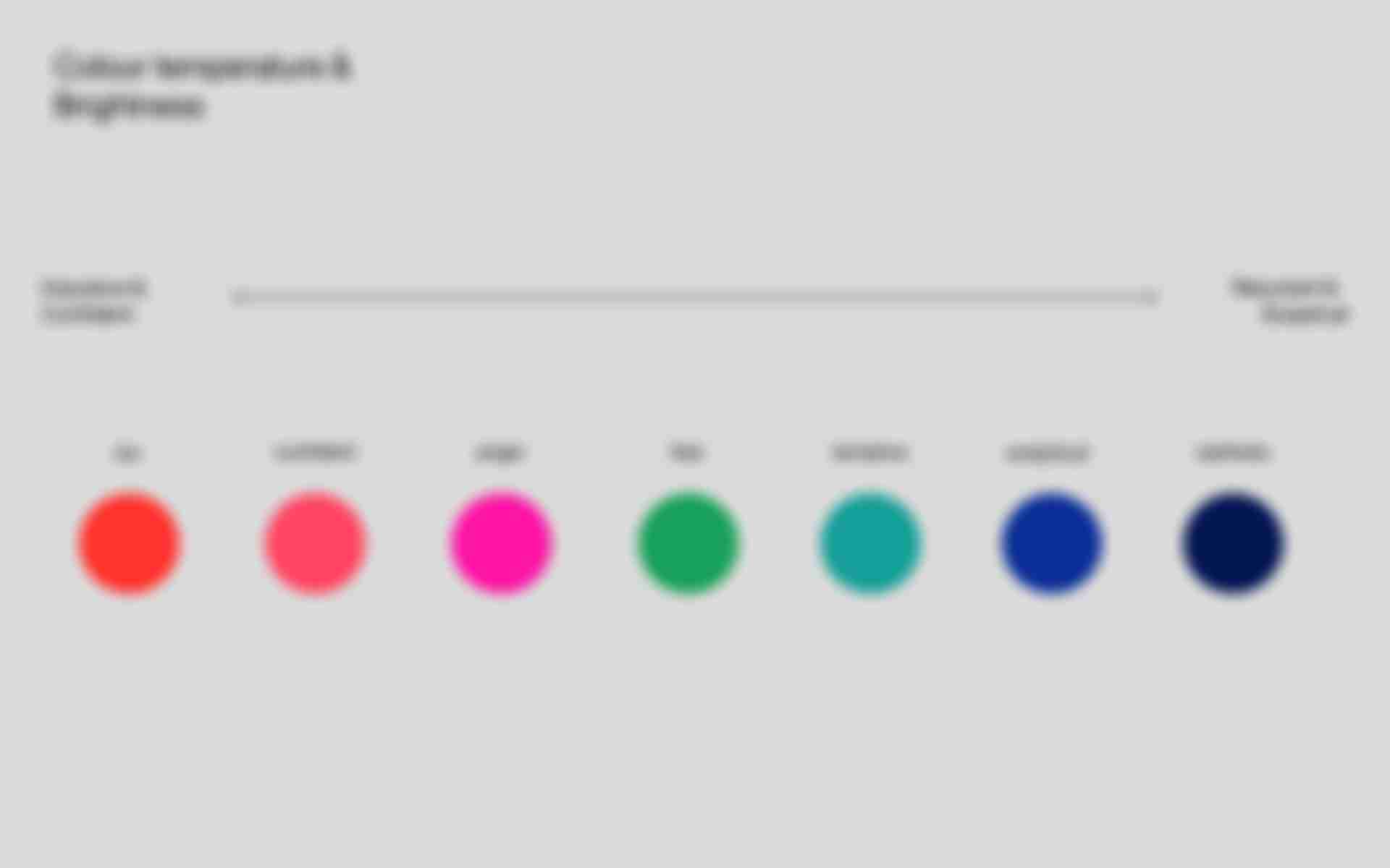
The interface lives strongly from the organic shaped graphic in the middle. This graphic consists of seven clusters, where each cluster represents one of seven emotions. The seven emotions are joy, confident, anger, fear, tentative, analytical and sadness. The graph can be zoomed in and out to view the individual clusters. When zooming into a cluster, you can see that it is filled with small circles, each circle representing a tweet.
In addition the graphic changes, depending on the setting of the timeline on the left side. For example if the timeline is set to the beginning of the pandemic, the graphic looks different than if the timeline is set to the middle course of the pandemic. This makes it possible to understand what the emotional state of society was at different stages during the pandemic.
Each emotion has also been assigned a colour to make the clustering of emotions more visually explicit. You can see which colour corresponds to which emotion in the legend at the bottom right of the interface. You can also switch individual emotions on and off via the legend.
In addition to the option of exploring the tweets via the graphic, you can also jump directly to a list view with the button at the bottom of the screen. This list view offers a chronological view of the tweets, in which you can view tweets in a more ordered way. Within this list, incisive events in the course of the pandemic are shown in order to put the emotional state into temporal context.
The font used is Fracktif by Studio Degarism.
Technical implementation
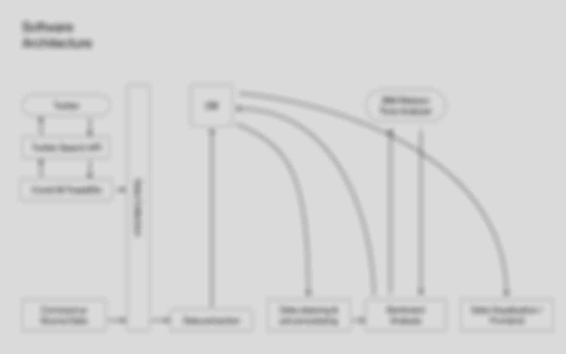
In order to enable the presentation of the data on the web, the data had to be prepared in a couple of steps. The first step is to collect all the necessary data. In my case, these are the tweets as well as the numbers of Corona cases. To get the individual tweets, the Twitter API is called with the tweet IDs from the data set and the API's response is saved. The Corona case numbers are obtained from the John Hopkins University Coronavirus Source Data dataset. In a further step, relevant data is then extracted from the API responses as well as from the Coronavirus Source Data dataset and stored in a MongoDB database.
Afterwards, the tweets are sent to the IBM Watson Tone Analyzer API to perform a sentiment analysis. This classifies the tweets into one of the seven emotions mentioned above. If a tweet is assigned to two or more emotions, the emotion with the highest value is selected. The emotion is then stored in the database for the matching tweet.
After the successful data preparation, the data can be displayed in a frontend according to the previous design.
Prospect
Unfortunately, the project has not yet made it beyond prototype status. However, I have already prepared some of the data and plan to implement this tool in the future. There will be an update here as soon as it is ready. 😉