Francesco
Scheffczyk

Echo Room
The starting point for the app "Echo Room" by Lars Hembacher and myself, was the following question.
Which areas of public life have been affected by the pandemic? How can we develop progressive, digital and ethically correct solutions?
We focused on the problem of closed clubs and bars. In doing so, we focused on two points:
- No income for clubs and DJs.
- Lack of space for hedonism and social interaction
User Research
In order to better understand our problem and possible solutions, Lars and I first embarked on a phase of user research. We collected both quantitative and qualitative data. For the quantitative data collection we used a form on Google Forms. For the qualitative data collection, we conducted 1-on-1 interviews with different people. Questions we asked included:
- How often do you usually go out?
- What is important to you when you go out?
- What kind of music do you party to?
- What do you do when you are in a club?
- What aspects of going out do you miss the most since Covid?
- How do you usually go out partying?
- What is your main goal when you go out partying?
- Etc.
Based on the answers, we then formulated different solutions, all of which were combined into a coherent app design.
Design Exploration
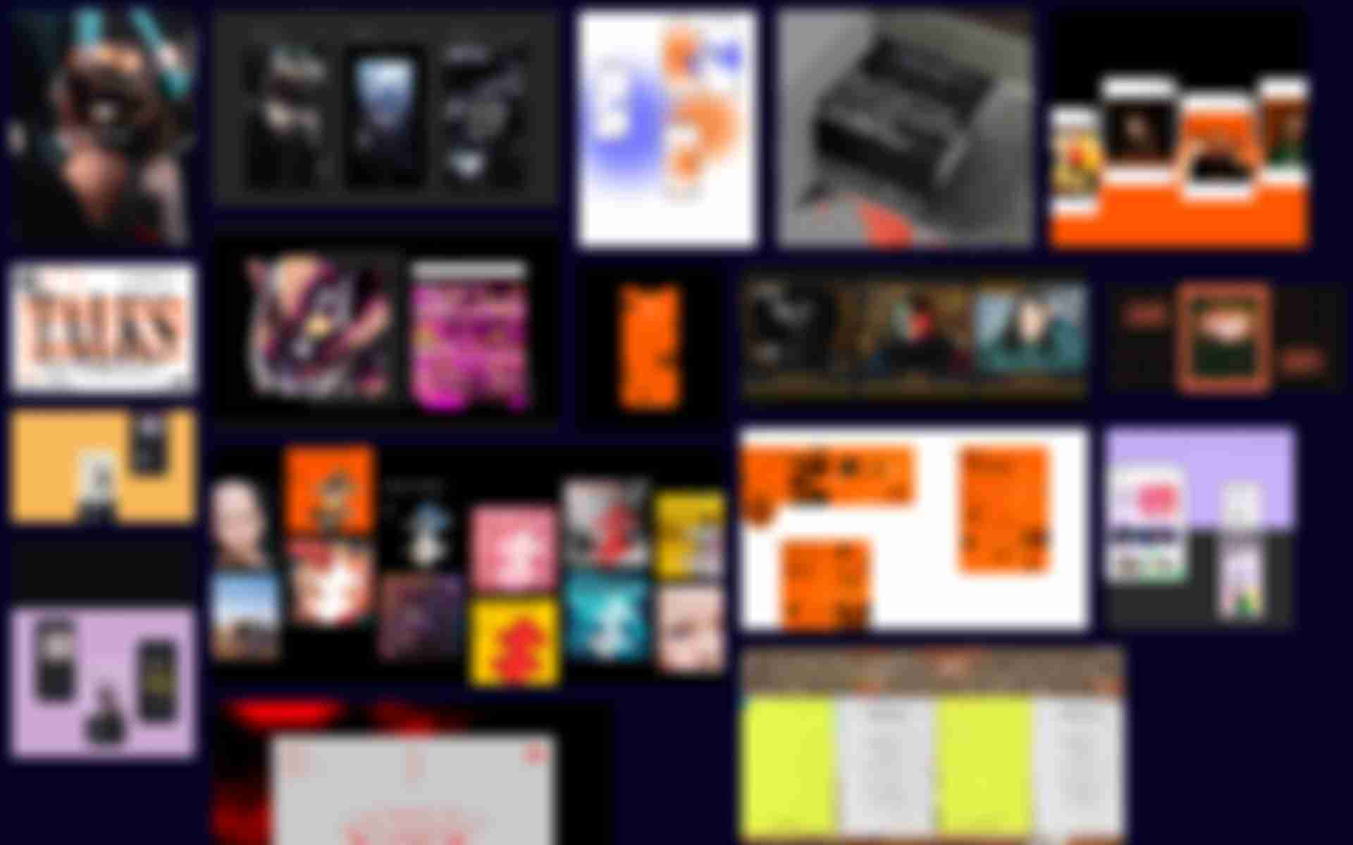
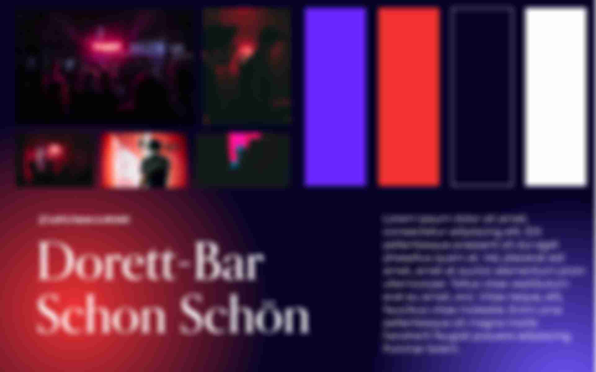
Before we could sketch and design the mentioned solutions, we first had to agree on a common design language. The process was such that we first worked out a common mood board to develop a general feeling for the visual direction. Then everyone sketched their own idea of the app through three or four screens.
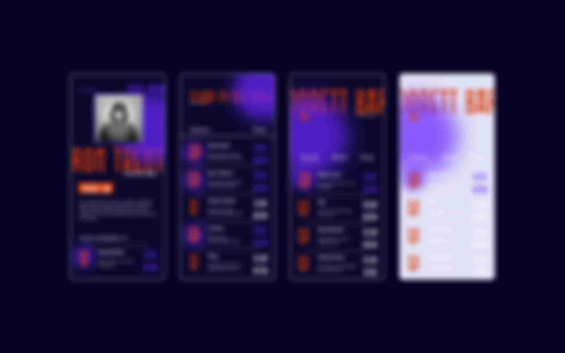
After discussing the resulting sketches, we combined various visual elements to create a coherent overall image. In terms of colour, we decided on a dark violet as the background colour and a bright pink as the accent colour, based on the colours of the lights of a club. Icons and font are displayed in white. We use Orpheus Pro from Canada Type as the display font and Degular from OH no Type as the text font.
Implementation
As mentioned earlier, we defined a wide variety of solutions to bring the club feeling home. You can join local clubs and watch the DJ live stream or chat with friends and strangers. It is possible to chat via text as well as video.
Within the DJ live stream, you can chat with other viewers and dance together via video call. You can also send visuals to the DJ, which are then played in real time in the club. This creates a direct level of influence and gives you the feeling of being more in the club.
In addition, there is the option to buy tickets for certain events in advance. This is shown directly to all friends, so that you can quickly and easily go out to party together. In addition to tickets, it is also possible to order so-called "party packages" from the club. These are delivered on the evening of the event and contain various elements to create a perfect party atmosphere within your own room.
Unfortunately, the app has not yet made it past the design and concept phase. But maybe Lars and I will get together again sometime to finish the app. 😉
You can find more information and design impressions on Lars Portfolio.